Another post starts with you beautiful people!
Today we will go through the plotting concepts so that you can draw your plot more clear.
How to create Multiple plots on single axis-
It is time now to put together some of what we have learned and combine line plots on a common set of axes.
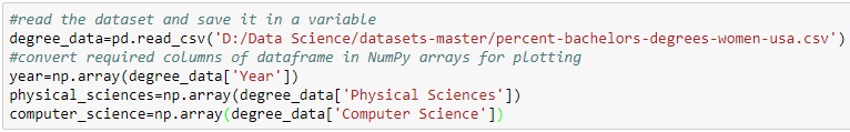
The data set here comes from records of undergraduate degrees awarded to women in a variety of fields from 1970 to 2011. You can download this dataset from here- download dataset
we can compare trends in degrees most easily by viewing two curves on the same set of axes.
we will issue two plt.plot() commands to draw line plots of different colors on the same set of axes.
Here, year represents the x-axis, while physical_sciences and computer_science are the y-axes.


Result:-

Well done! It looks like, for the last 25 years or so, more women have been awarded undergraduate degrees in the Physical Sciences than in Computer Science.
How to use axes()-
Rather than overlaying line plots on common axes, we may prefer to plot different line plots on distinct axes.
The command plt.axes() is one way to do this (but it requires specifying coordinates relative to the size of the figure).
we will use plt.axes() to create separate sets of axes in which we will draw each line plot.
In calling plt.axes([xlo, ylo, width, height]), a set of axes is created and made active with lower corner at coordinates (xlo, ylo) of the specified width and height. Note that these coordinates can be passed to plt.axes() in the form of a list or a tuple.
The coordinates and lengths are values between 0 and 1 representing lengths relative to the dimensions of the figure.
After issuing a plt.axes() command, plots generated are put in that set of axes.

Result-

Great work! As we can see, not only are there now two separate plots with their own axes, but the axes for each plot are slightly different.
How to use subplot() (1)-
The command plt.axes() requires a lot of effort to use well because the coordinates of the axes need to be set manually.
A better alternative is to use plt.subplot() to determine the layout automatically.
Rather than using plt.axes() to explicitly lay out the axes, we will use plt.subplot(m, n, k)
to make the subplot grid of dimensions m by n and to make the kth subplot active
(subplots are numbered starting from 1 row-wise from the top left corner of the subplot grid).

Result-

Excellent work! Using subplots like this is a better alternative to using plt.axes().
How to use subplot() (2)-
Now we have some familiarity with plt.subplot(), we can use it to plot more plots in larger grids of subplots of the same figure.
Here, we will make a 2×2 grid of subplots and plot the percentage of degrees awarded to women in Physical Sciences
(using physical_sciences), in Computer Science (using computer_science)

Result-

How to use xlim(), ylim()-
In this exercise, we will work with the matplotlib.pyplot interface to quickly set the x- and y-limits of plots.
we will now create the same figure as in the previous exercise using plt.plot(), this time setting the axis extents using plt.xlim() and plt.ylim(). These commands allow we to either zoom or expand the plot or to set the axis ranges to include important values (such as the origin).
After creating the plot, we will use plt.savefig() to export the image produced to a file.

Result-

Fantastic! This plot effectively captures the difference in trends between 1990 and 2010.
How to use axis()-
Using plt.xlim() and plt.ylim() are useful for setting the axis limits individually.
In this exercise, we will see how we can pass a 4-tuple to plt.axis() to set limits for both axes at once.
For example, plt.axis((1980,1990,0,75)) would set the extent of the x-axis to the period between 1980 and 1990, and would set the y-axis extent from 0 to 75% degrees award.

Result-

Superb! Using plt.axis() allows we to set limits for both axes at once, as opposed to setting them individually with plt.xlim() and plt.ylim().
How to use legend()-
Legends are useful for distinguishing between multiple datasets displayed on common axes.
The relevant data are created using specific line colors or markers in various plot commands.
Using the keyword argument label in the plotting function associates a string to use in a legend.
For example, here, we will plot enrollment of women in the Physical Sciences and in Computer Science over time.
we can label each curve by passing a label argument to the plotting call, and request a legend using plt.legend().
Specifying the keyword argument loc determines where the legend will be placed.

Result-

Excellent work! we should always use axes labels and legends to help make wer plots more readable.
How to use annotate()-
It is often useful to annotate a simple plot to provide context. This makes the plot more readable
and can highlight specific aspects of the data. Annotations like text and arrows can be used to emphasize specific observations.
The legend is set up as before. Additionally, we will mark the inflection point when enrollment of women in Computer Science reached a peak and started declining using plt.annotate().
To enable an arrow, set arrowprops=dict(facecolor='black'). The arrow will point to the location given by xy and the text will appear at the location given by xytext.

Result-

Great work! Annotations are extremely useful to help make more complicated plots easier to understand.
How to modify styles-
Matplotlib comes with a number of different stylesheets to customize the overall look of different plots.
To activate a particular stylesheet we can simply call plt.style.use() with the name of the style sheet we want.
To list all the available style sheets we can execute: print(plt.style.available).

Result-

Fantastic! The 'ggplot' style is a popular one.
KeyNote:-Histograms are great ways of visualizing single variables. To visualize multiple variables, boxplots are useful, especially when one of the variables is categorical.
I hope after doing the above exercises in your notebook you will become more confident about plotting so keep practicing.
Today we will go through the plotting concepts so that you can draw your plot more clear.
How to create Multiple plots on single axis-
It is time now to put together some of what we have learned and combine line plots on a common set of axes.
The data set here comes from records of undergraduate degrees awarded to women in a variety of fields from 1970 to 2011. You can download this dataset from here- download dataset
we can compare trends in degrees most easily by viewing two curves on the same set of axes.
we will issue two plt.plot() commands to draw line plots of different colors on the same set of axes.
Here, year represents the x-axis, while physical_sciences and computer_science are the y-axes.

Result:-

Well done! It looks like, for the last 25 years or so, more women have been awarded undergraduate degrees in the Physical Sciences than in Computer Science.
How to use axes()-
Rather than overlaying line plots on common axes, we may prefer to plot different line plots on distinct axes.
The command plt.axes() is one way to do this (but it requires specifying coordinates relative to the size of the figure).
we will use plt.axes() to create separate sets of axes in which we will draw each line plot.
In calling plt.axes([xlo, ylo, width, height]), a set of axes is created and made active with lower corner at coordinates (xlo, ylo) of the specified width and height. Note that these coordinates can be passed to plt.axes() in the form of a list or a tuple.
The coordinates and lengths are values between 0 and 1 representing lengths relative to the dimensions of the figure.
After issuing a plt.axes() command, plots generated are put in that set of axes.

Result-

Great work! As we can see, not only are there now two separate plots with their own axes, but the axes for each plot are slightly different.
How to use subplot() (1)-
The command plt.axes() requires a lot of effort to use well because the coordinates of the axes need to be set manually.
A better alternative is to use plt.subplot() to determine the layout automatically.
Rather than using plt.axes() to explicitly lay out the axes, we will use plt.subplot(m, n, k)
to make the subplot grid of dimensions m by n and to make the kth subplot active
(subplots are numbered starting from 1 row-wise from the top left corner of the subplot grid).

Result-

Excellent work! Using subplots like this is a better alternative to using plt.axes().
How to use subplot() (2)-
Now we have some familiarity with plt.subplot(), we can use it to plot more plots in larger grids of subplots of the same figure.
Here, we will make a 2×2 grid of subplots and plot the percentage of degrees awarded to women in Physical Sciences
(using physical_sciences), in Computer Science (using computer_science)

Result-

How to use xlim(), ylim()-
In this exercise, we will work with the matplotlib.pyplot interface to quickly set the x- and y-limits of plots.
we will now create the same figure as in the previous exercise using plt.plot(), this time setting the axis extents using plt.xlim() and plt.ylim(). These commands allow we to either zoom or expand the plot or to set the axis ranges to include important values (such as the origin).
After creating the plot, we will use plt.savefig() to export the image produced to a file.

Result-

Fantastic! This plot effectively captures the difference in trends between 1990 and 2010.
How to use axis()-
Using plt.xlim() and plt.ylim() are useful for setting the axis limits individually.
In this exercise, we will see how we can pass a 4-tuple to plt.axis() to set limits for both axes at once.
For example, plt.axis((1980,1990,0,75)) would set the extent of the x-axis to the period between 1980 and 1990, and would set the y-axis extent from 0 to 75% degrees award.

Result-

Superb! Using plt.axis() allows we to set limits for both axes at once, as opposed to setting them individually with plt.xlim() and plt.ylim().
How to use legend()-
Legends are useful for distinguishing between multiple datasets displayed on common axes.
The relevant data are created using specific line colors or markers in various plot commands.
Using the keyword argument label in the plotting function associates a string to use in a legend.
For example, here, we will plot enrollment of women in the Physical Sciences and in Computer Science over time.
we can label each curve by passing a label argument to the plotting call, and request a legend using plt.legend().
Specifying the keyword argument loc determines where the legend will be placed.

Result-

Excellent work! we should always use axes labels and legends to help make wer plots more readable.
How to use annotate()-
It is often useful to annotate a simple plot to provide context. This makes the plot more readable
and can highlight specific aspects of the data. Annotations like text and arrows can be used to emphasize specific observations.
The legend is set up as before. Additionally, we will mark the inflection point when enrollment of women in Computer Science reached a peak and started declining using plt.annotate().
To enable an arrow, set arrowprops=dict(facecolor='black'). The arrow will point to the location given by xy and the text will appear at the location given by xytext.
Result-

Great work! Annotations are extremely useful to help make more complicated plots easier to understand.
How to modify styles-
Matplotlib comes with a number of different stylesheets to customize the overall look of different plots.
To activate a particular stylesheet we can simply call plt.style.use() with the name of the style sheet we want.
To list all the available style sheets we can execute: print(plt.style.available).
Result-

Fantastic! The 'ggplot' style is a popular one.
KeyNote:-Histograms are great ways of visualizing single variables. To visualize multiple variables, boxplots are useful, especially when one of the variables is categorical.
I hope after doing the above exercises in your notebook you will become more confident about plotting so keep practicing.
It was really a nice article and i was really impressed by reading this Data Science online Training India
ReplyDelete